Posted by: partyhorse | February 11, 2010

Title here

Having a keen interest in design especially anything to do with films, I always like to see all the aspects that go into a movie that are design related. From set design to the end credits, it all ties together much like any of the projects I’m working on, they all have to fit into a bigger picture. For example does this packaging fit into the current range? Does this newsletter match the style and feel of the brand?
STOP
The first thing that grabs your attention while watching a film is the title, the style, colour and font not only portrays what the film is about but also what period it was made. Back to the future, is one of my favorites and is about time travel so could of been an amalgamation of things, it just screams 80’s design which is why I love it.
COPYING
Throughout the late 90’s and 00’s you can see the implementation of CAD even the hand drawn style titles look computer generated which is a shame when you consider the skill used to create the hand drawn titles of the very early 90’s
OUR
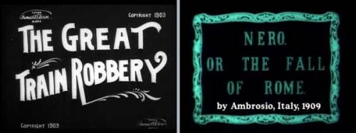
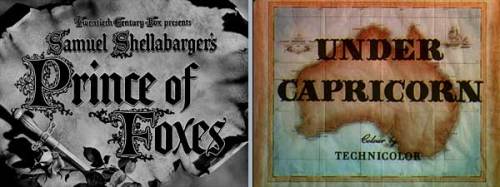
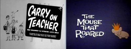
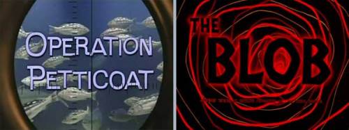
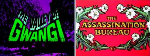
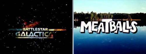
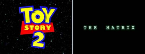
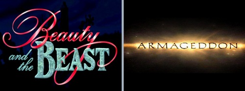
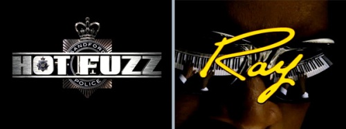
Below is a selection of film title still, see if any bring back memories.
BLOGS

1900-1919

BLOGS

BLOGS

1920-1929

BLOGS

BLOGS

1930-1939

BLOGS

BLOGS

1940-1949

BLOGS

BLOGS

1950-1959

BLOGS

BLOGS

1960-1969

BLOGS

BLOGS

1970-1979

BLOGS

BLOGS

1980-1989

BLOGS

BLOGS

1990-1999

BLOGS

BLOGS

2000-2009

BLOGS
NO!
Bookmark and Share

Posted by: partyhorse | January 13, 2010

Flowers, Football, surely not

<BR>>
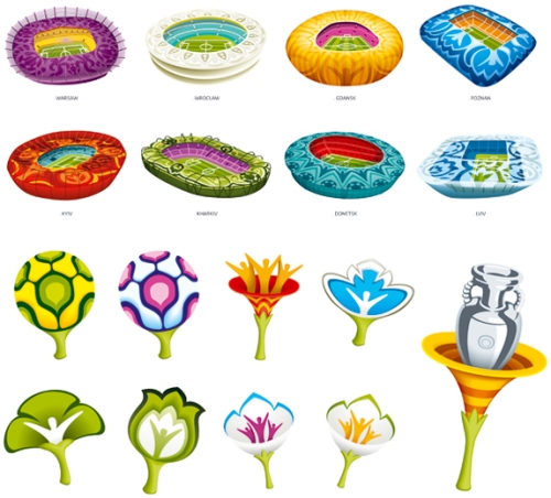
Having seen the new brand for UEFA EURO2012 which is designed by Portuguese group Brandia Central I have to say that I’m less than impressed. The logo is the stalk of a flower with three branches. A ball is depicted as the central flower, with the left flower being red and white (the colors of Poland’s flag) and the right flower being yellow and blue (the colors of Ukraine’s flag). One thing I do like though is this video revealing the new brand.
<BR>
<BR>
<BR>
<BR>
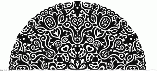
Brandia have used wycinanki as a basis for the branding, but the end result looks a bit like a bad computer game, maybe it would of worked better if it looked more traditional and less computer generated. Wycinanki originated in Poland with sheepherders cutting designs out of tree bark and leather. Paper wycinanki dates from the early to mid 19th century and colourful wycinanki were pasted on furniture or roof beams as decoration, hung in windows, and given as gifts.
Original wycinanki
<BR>
New designs
<BR>
Some of the black and white designs are quite intricate and the more you look at them the more references to football you spot. All in all they all look ok, but just dont say football, they seem over designed. Dieter Rams once said “Good design is as little design as possible”.
Bookmark and Share
Posted by: partyhorse | January 12, 2010

Mr Chicken

After a night out in Leeds, heading home (a flat on North Street) is always a colourful experience. Not just because of the delightful characters that are wondering about after dark, but the array of fast food outlets.

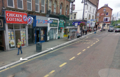
These are not your McDonalds or KFC’s though, Im talking about Perfect Fried Chicken and Chicken Cottage, you know the ones, offers like chicken and chips for a pound adorn the window. It got me thinking though who designs their signs.

Morris Cassanova (aka Mr Chicken) designs and makes signs for around 90% of the fried chicken shops in the UK his company is called MBC Signs. Siâron Hughes a designer from London has written a book on the subject called  Chicken: Low Art, High Calorie.

One thing you notice is that nearly all the signs have some reference to America, whether it be name, colour scheme or general design. Mr Chicken said on the subject “The majority of shop owners out there they want for some reason or other, because Kentucky Fried Chicken is an American company, they want to give the impression that they are linked with the American fast food chain. In the past Kentucky usually have a little logo, a little slogan, “American Recipe,” people used to copy that. I mean a lot of people still try, and we say, “Oh that’s old fashioned, people not using that again.” Because they try to pull the wool over people’s eyes, you get your Dallas, it’s American, you get your California, it’s American, you get your Mississippi it’s American, and so forth and so on, and people just use those names to link with America just as well as they’re using their recipe, y’know. You hardly ever see a sign saying English Fried Chicken, or with an English name or anything like that”.

All in all I think credit is due, most of the signage appears the same but there are differences, subtle as they may be.

Older Posts »

Categories